I like the new shape of the user interface, the 5 menus are the main core of the app and stand as they should be.
Honorable mention for the Social part, which organizes very well all the community aspects with the tastings, the forum, the bottles splits (even though they are already on the forum, that’s a fast paced feature) and the rankings among the community (which has been built thanks to us partially).
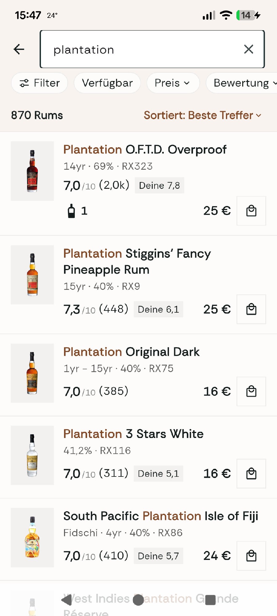
The Search section is also good, I like how things can be sorted out after the filters as well. I guess it does require time to get used to it with all the menus and buttons, it’s slightly overwhelming at first glance but I’m still getting in touch with it but so far I like it. It’s smooth and helpful.
I like how many details have been put for the distilleries and the countries, that really gives insights about rum history and terroirs for everyone, to have not just a bottle database, but also all the other backgrounds and the lore, that’s excellent !
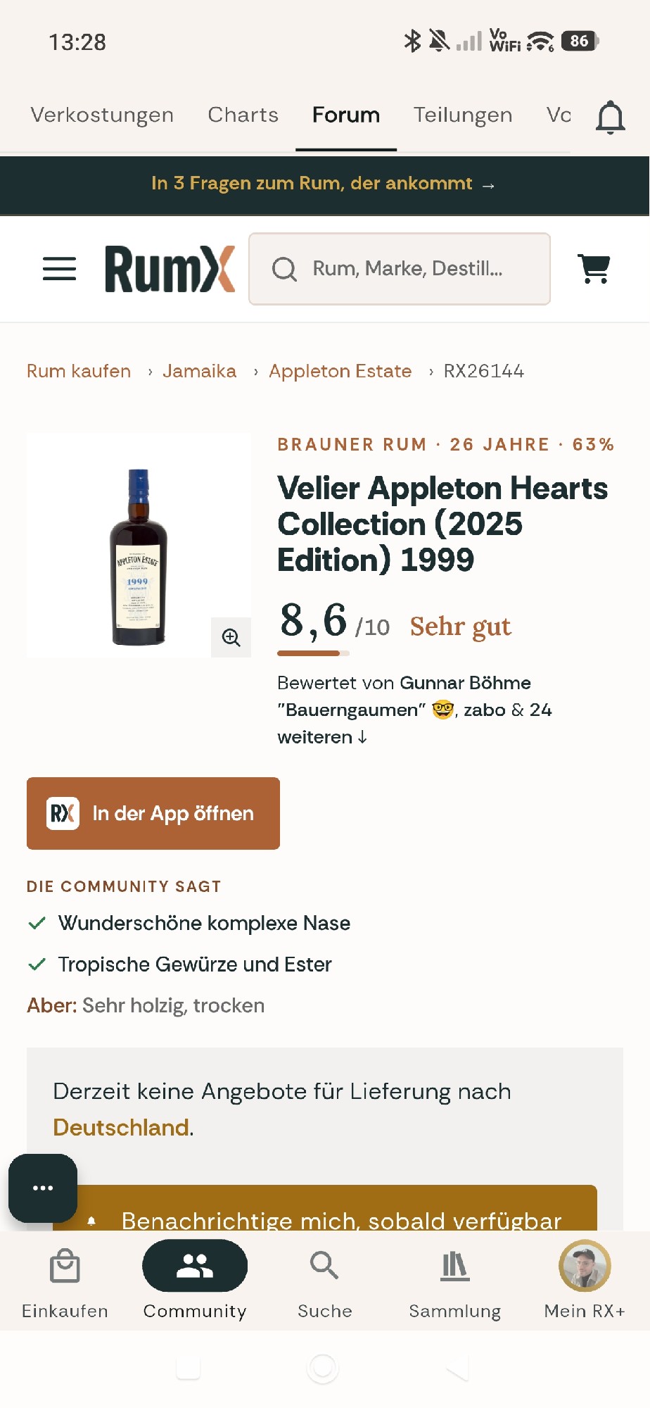
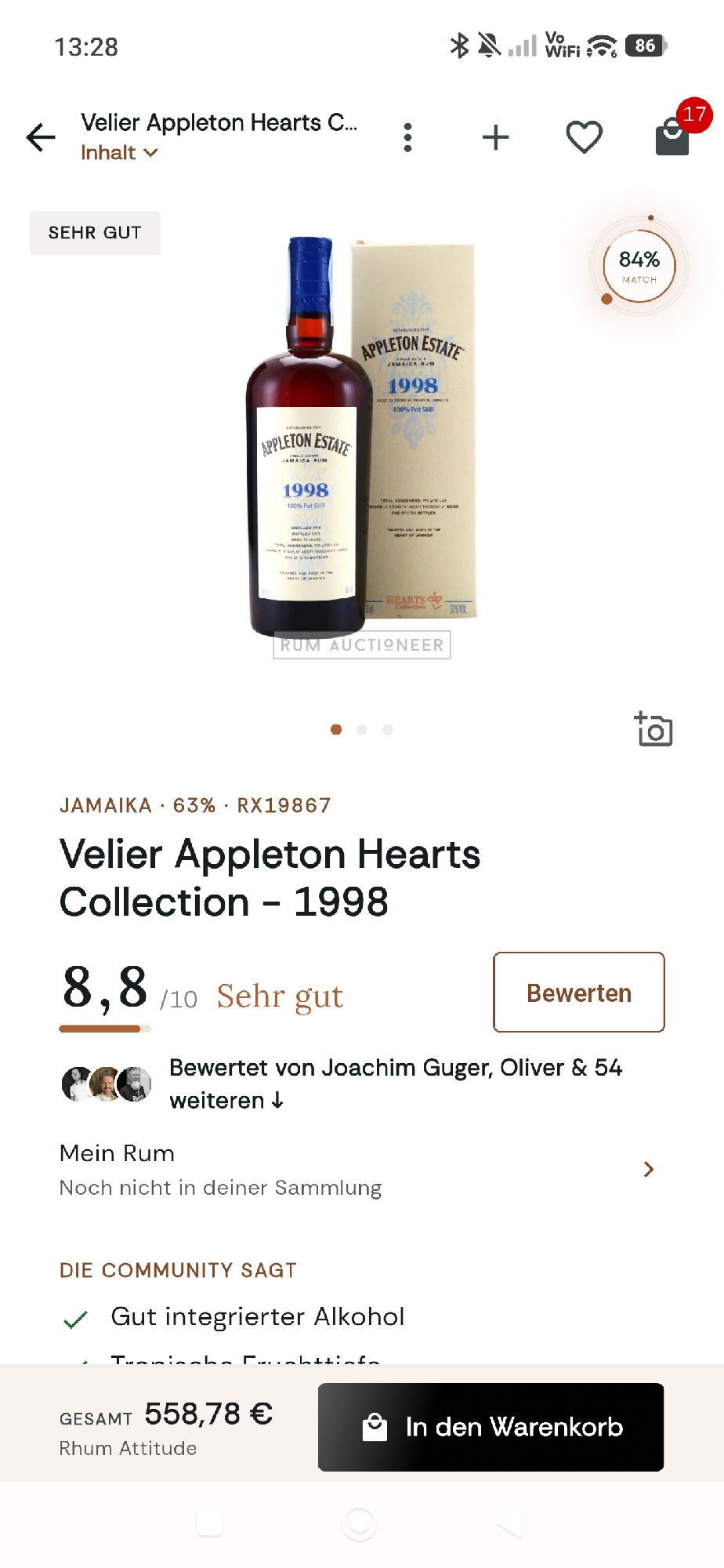
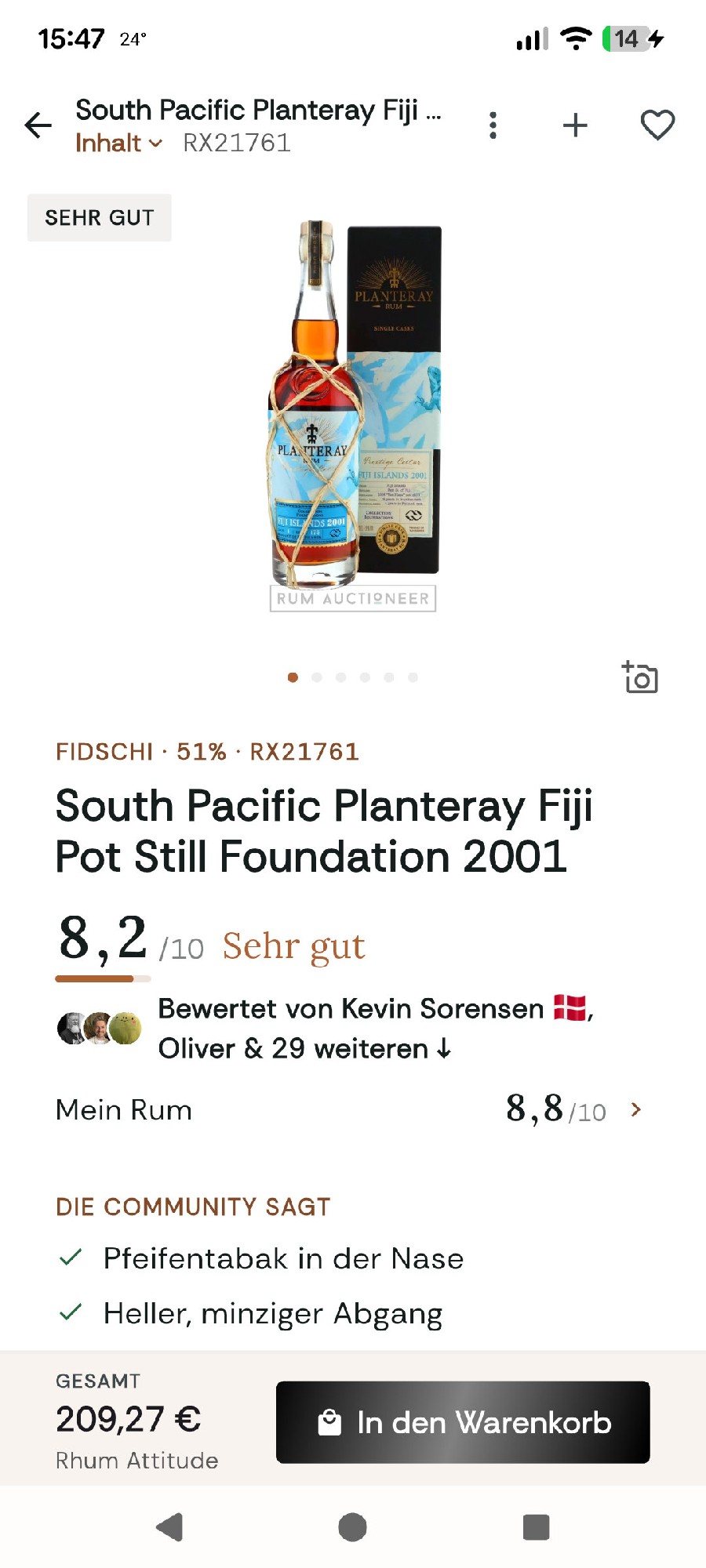
One thing I would point out though, is the rum datasheet, it does feel a bit overwhelming as well. In my opinion, the Origin & Data section should be above the rest, above the aromatic profile so that we have all the technical features at first glance (just like in a book) and then all the feedbacks from the community (and our own tasting).
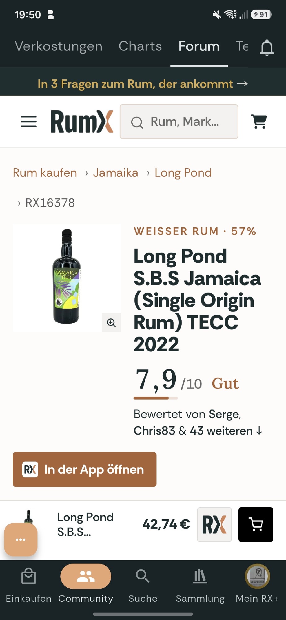
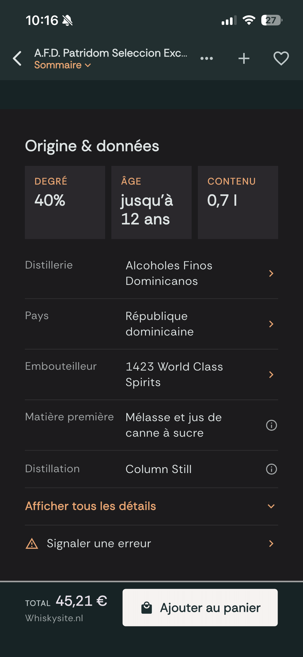
I gotta say that I also prefered the previous data visualization, with the 2 columns, the images for the raw material, the distillation and the casks were more visually attractive to me. I also noticed that the app shows you 3 key data from the rum, but sometimes it does not feel appealing (see the picture below, one of the highlights is the fact it’s a 70 cl bottle  ). I believe something can be done to make it more user-friendly and appealing to people’s eyes

Overall I have a good perception of this update, it feels like the great tool to help you in your journey in the Rum Verse. It will take a bit of time to be totally adopted, but it feels good and somehow « complete » as a tool 


 ???




 I hope I can get used to it.